Cornell RideShare
Challenge:
Cornell RideShare, a ride-sharing service for Cornell students, faced multiple challenges. The website was confusing, had dead-end pages, and the ride scheduling system was inefficient.
User Research & Personas:
I conducted UX research by interviewing student users and analyzing their ride-booking behaviors.
Task Flow & Sitemap:
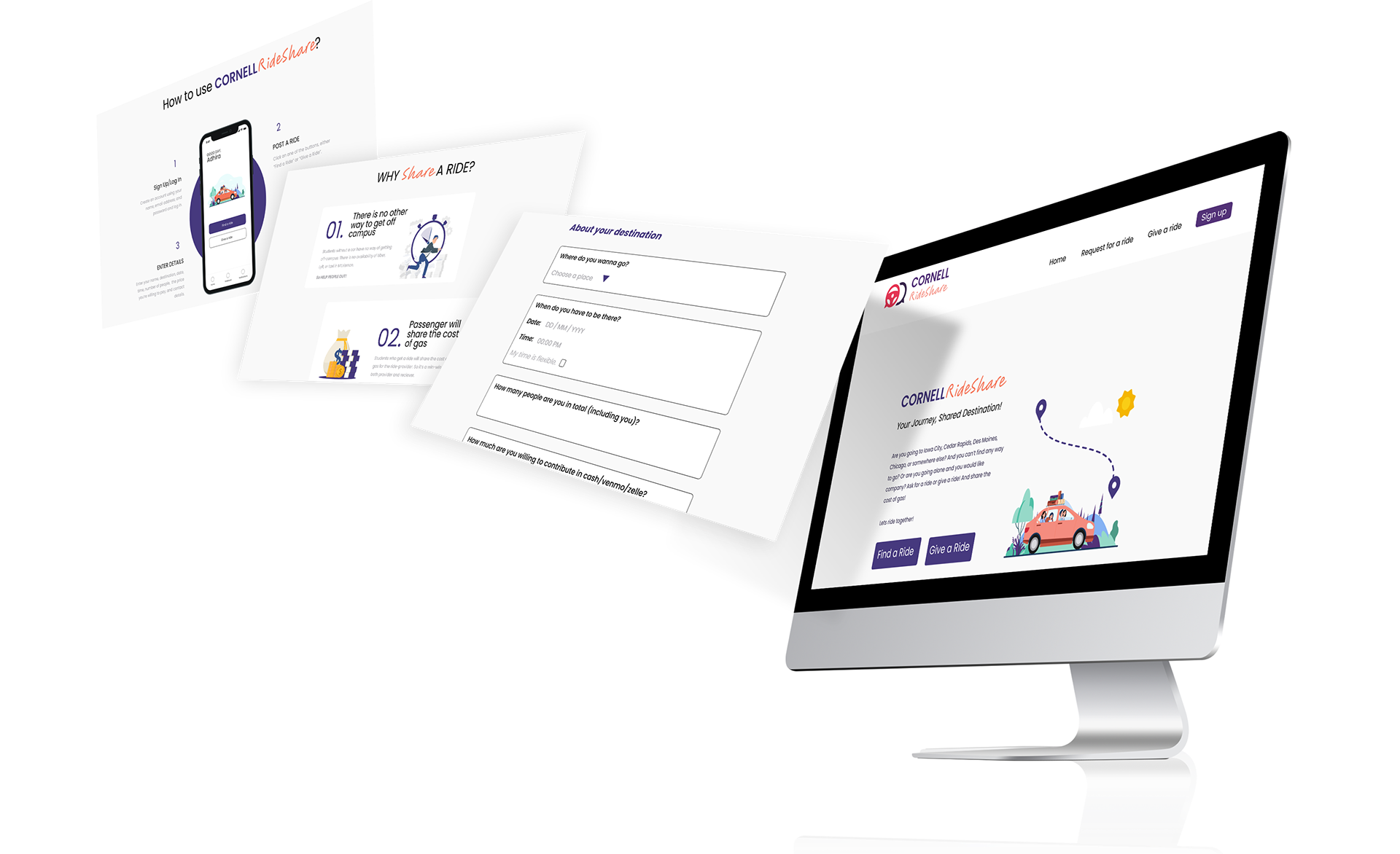
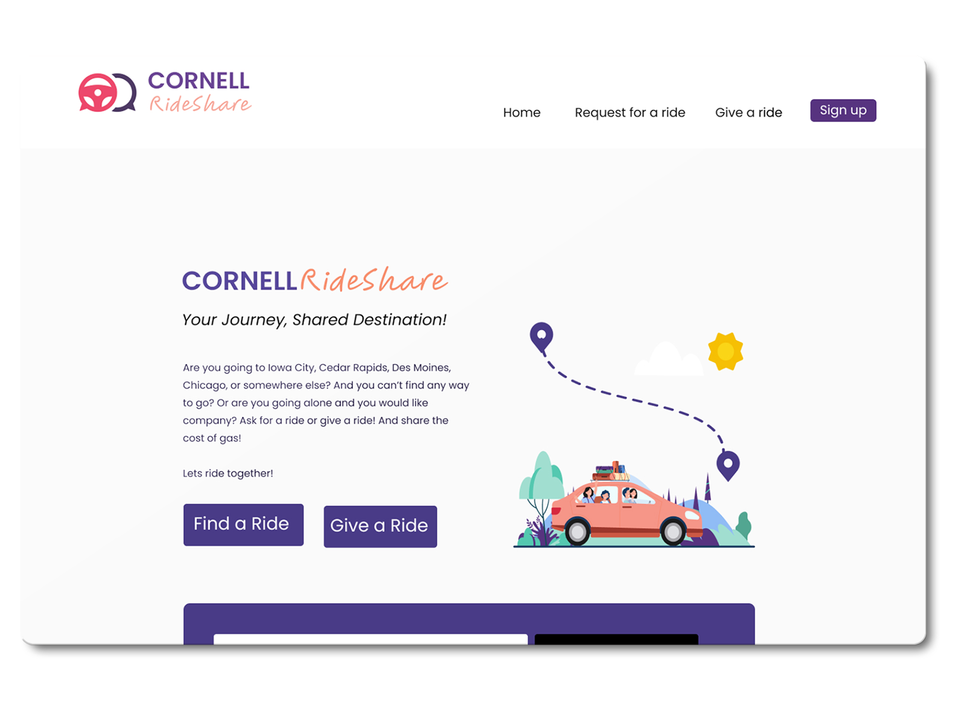
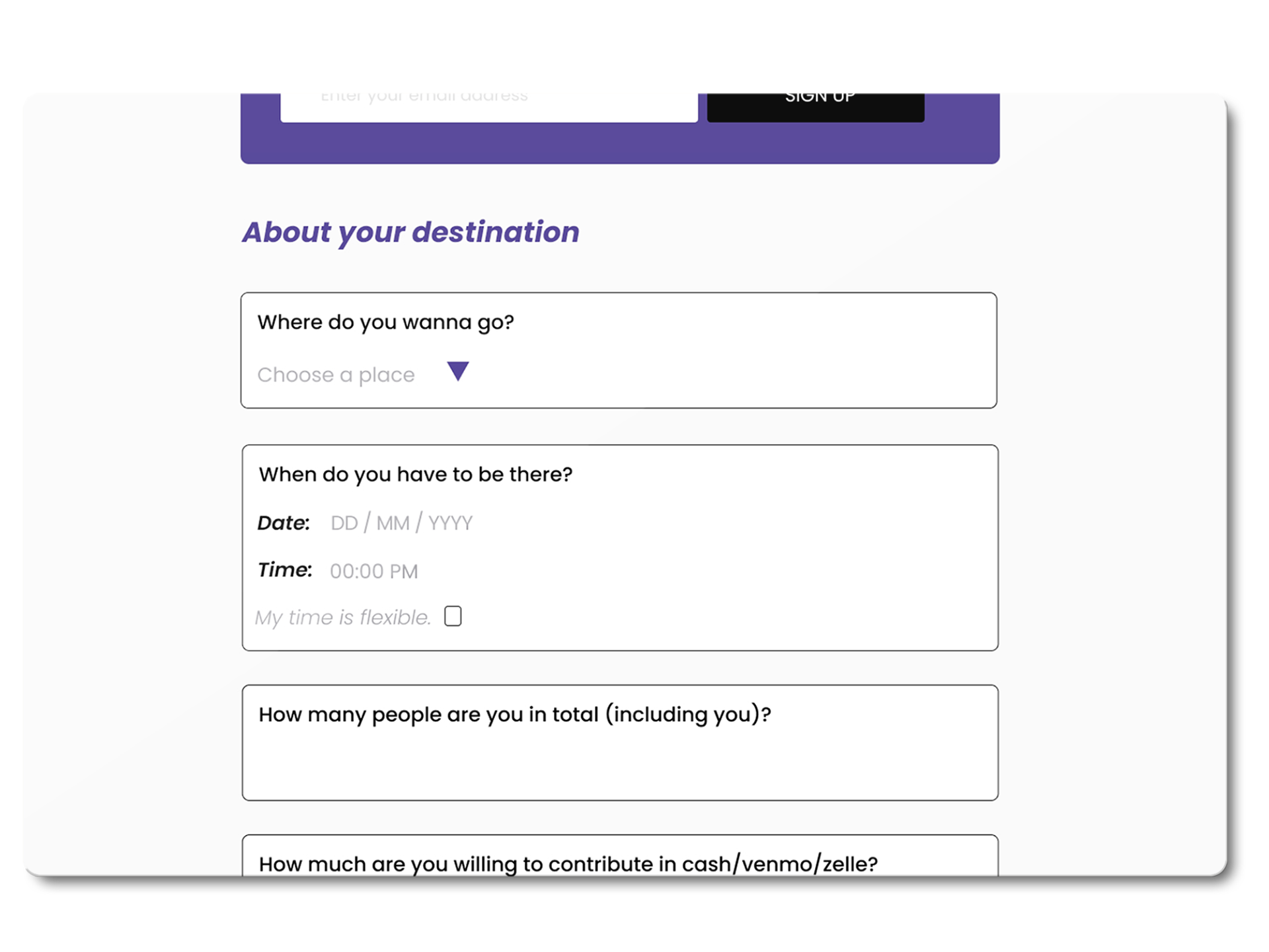
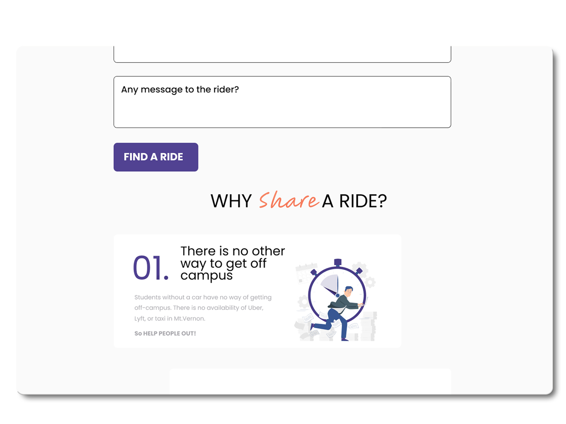
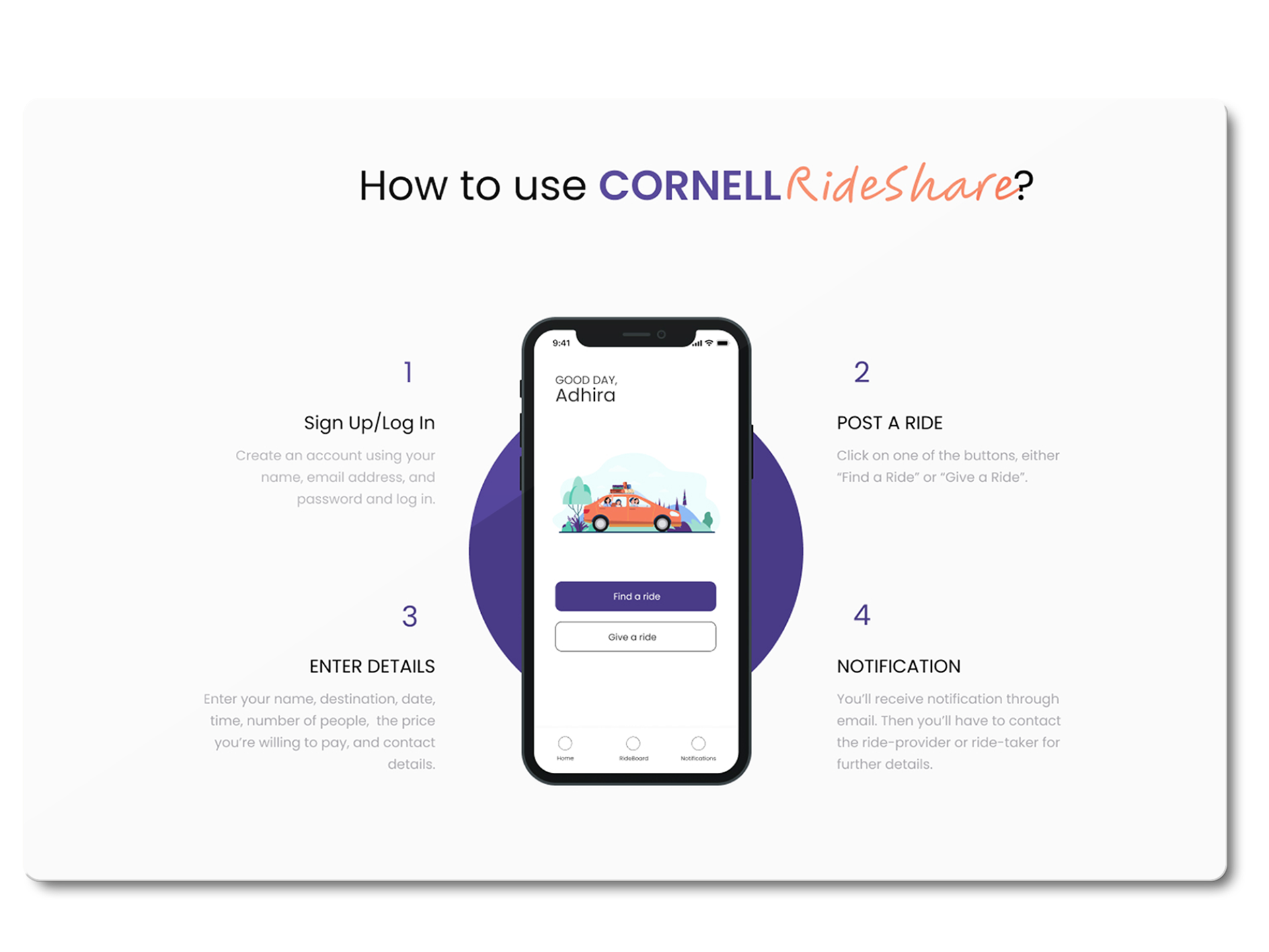
One of the biggest issues was the confusion surrounding ride booking. I redefined the user task flow to prioritize a clear path: entering ride details upfront, selecting a driver, and confirming the ride.
Wireframes & Usability Testing:
I placed the ride-booking prompt front and center and removed unnecessary information to streamline the user journey. Usability testing showed that users were now able to schedule rides in less than half the time compared to the old system.
Outcome:
The rebranding and UI/UX improvements made the website more functional, increasing student engagement with the service. Ride bookings increased, and customer feedback was overwhelmingly positive, with users praising the new streamlined booking system and the professional look of the brand.
Palisades Cafe
Challenge
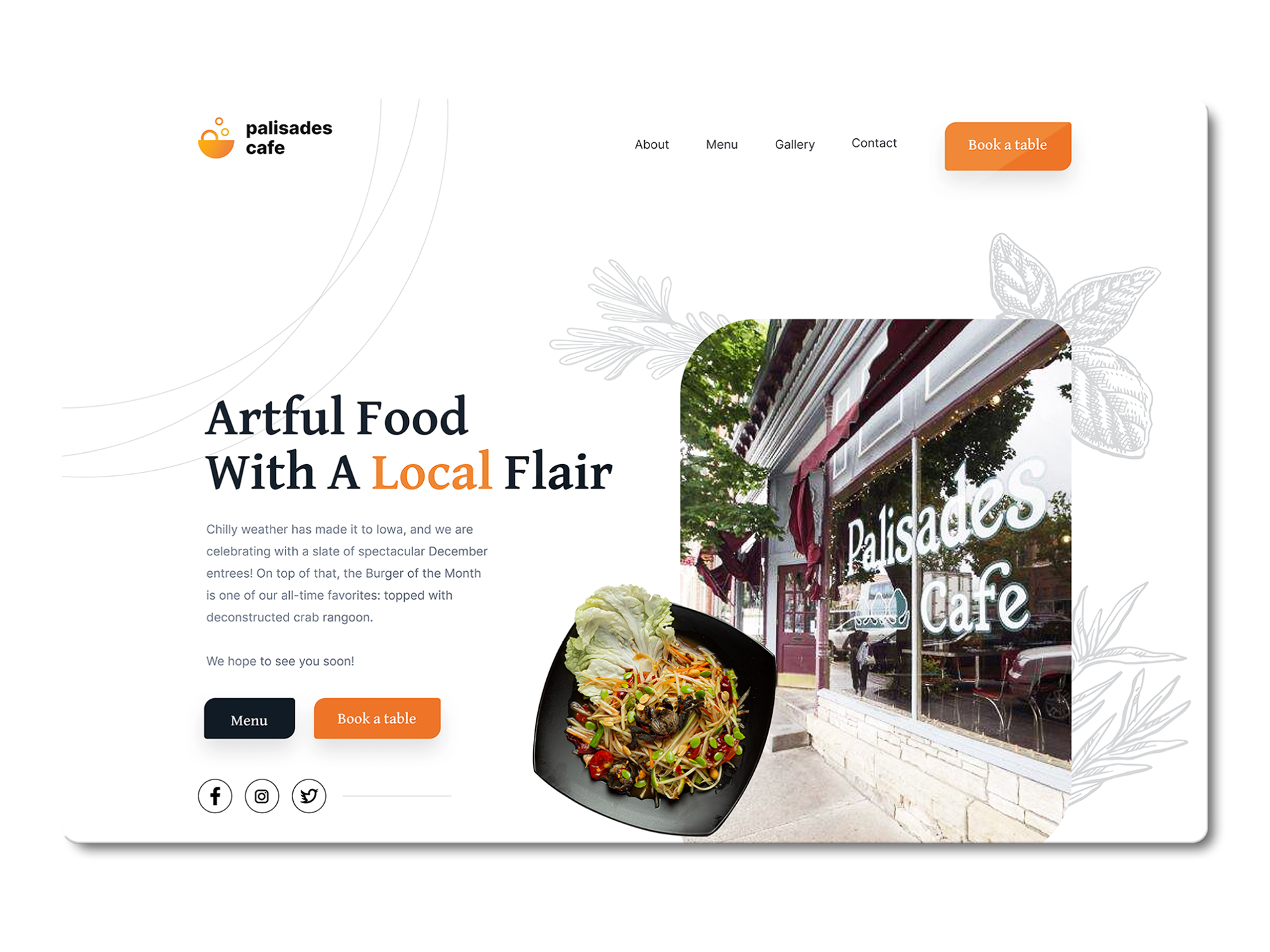
Palisades Cafe, a family-owned restaurant in Mt. Vernon, struggled with an outdated website that was difficult to navigate and didn’t reflect the quality of their offerings. Customers found it cumbersome to make reservations and learn about the cafe's farm-to-table menu.
Palisades Cafe, a family-owned restaurant in Mt. Vernon, struggled with an outdated website that was difficult to navigate and didn’t reflect the quality of their offerings. Customers found it cumbersome to make reservations and learn about the cafe's farm-to-table menu.
Action
I began with UX research, identifying key pain points through customer feedback and analyzing competitors. Customers sought a streamlined process for reservations and a simple way to view the seasonal menu. The user segment was primarily locals and tourists who valued locally sourced, fresh ingredients and a community-driven dining experience.
Sitemap and Task Flow
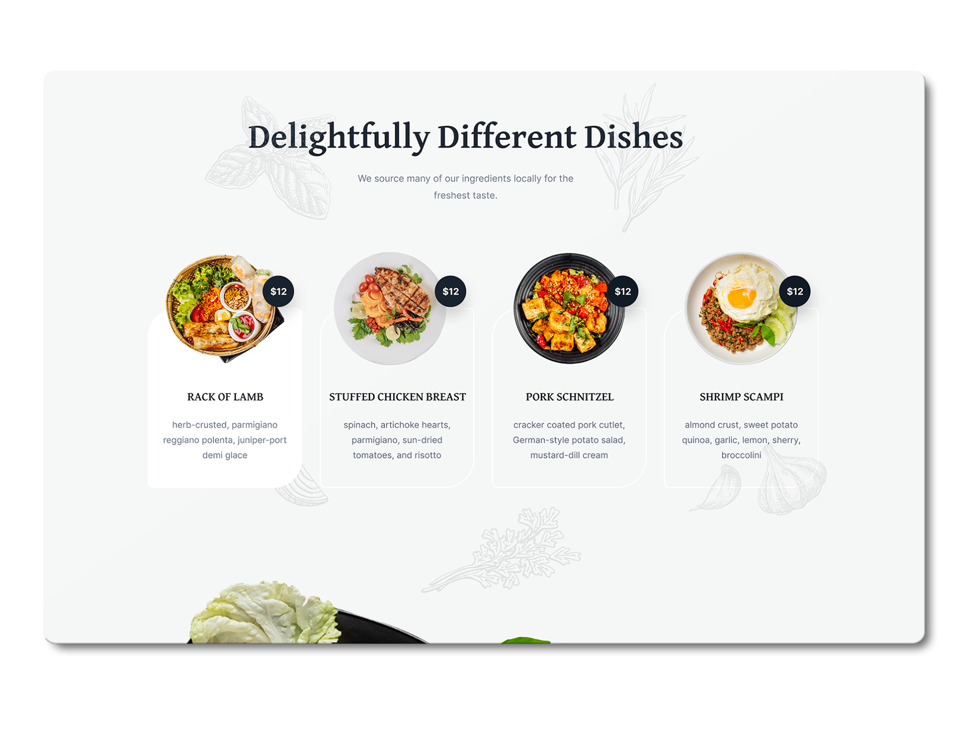
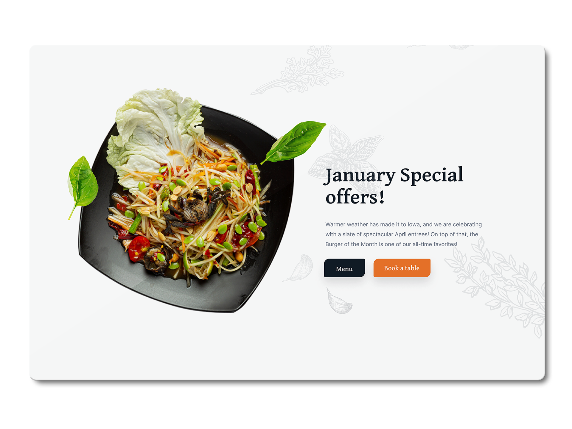
The old website was cluttered, so I trimmed it down to essential pages: Home, Menu, Reservations, and About Us. I created a task flow prioritizing quick access to reservations and menus, with minimal friction. The reservation flow was simplified to reduce steps and make it clear from the start.
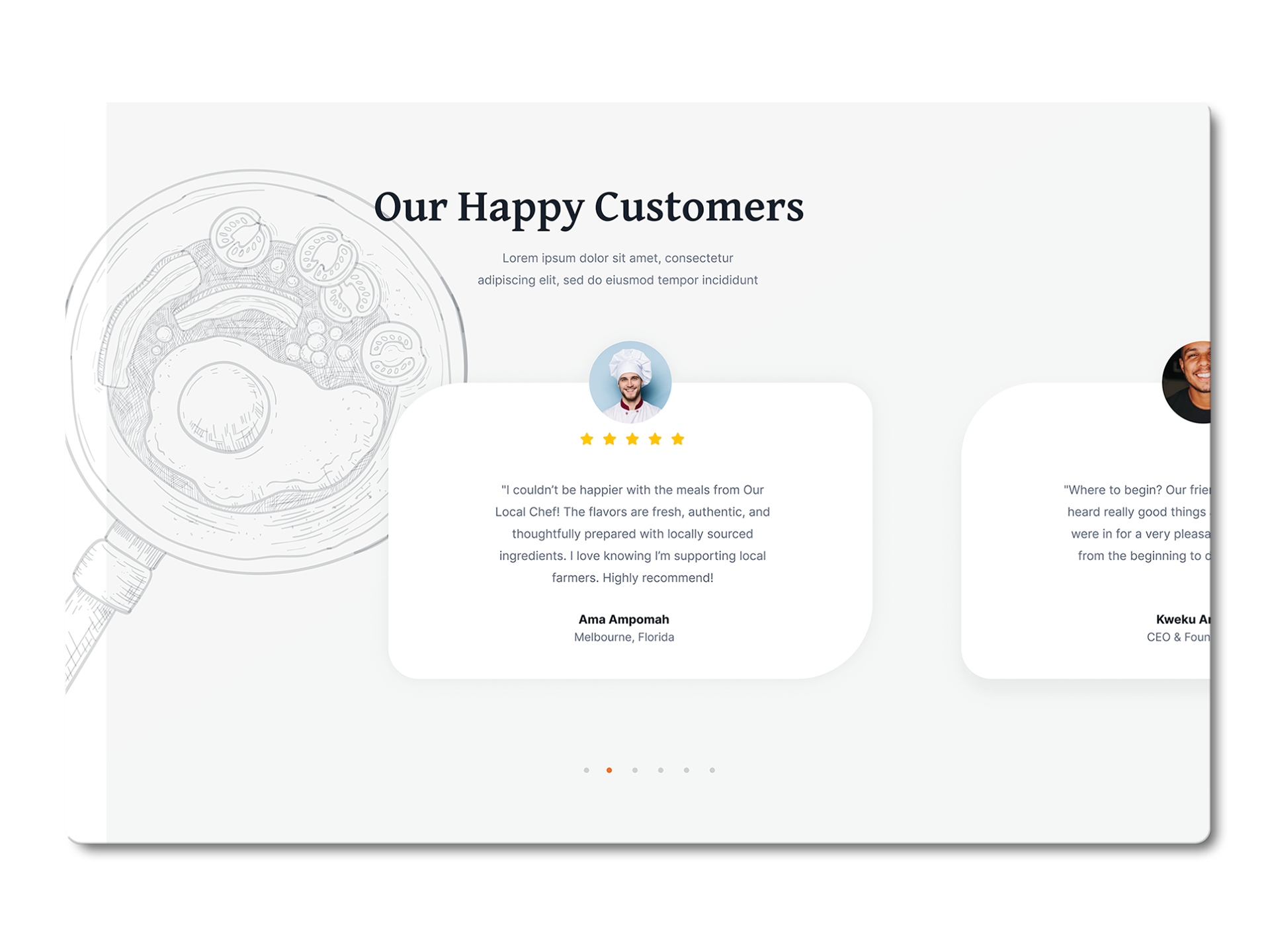
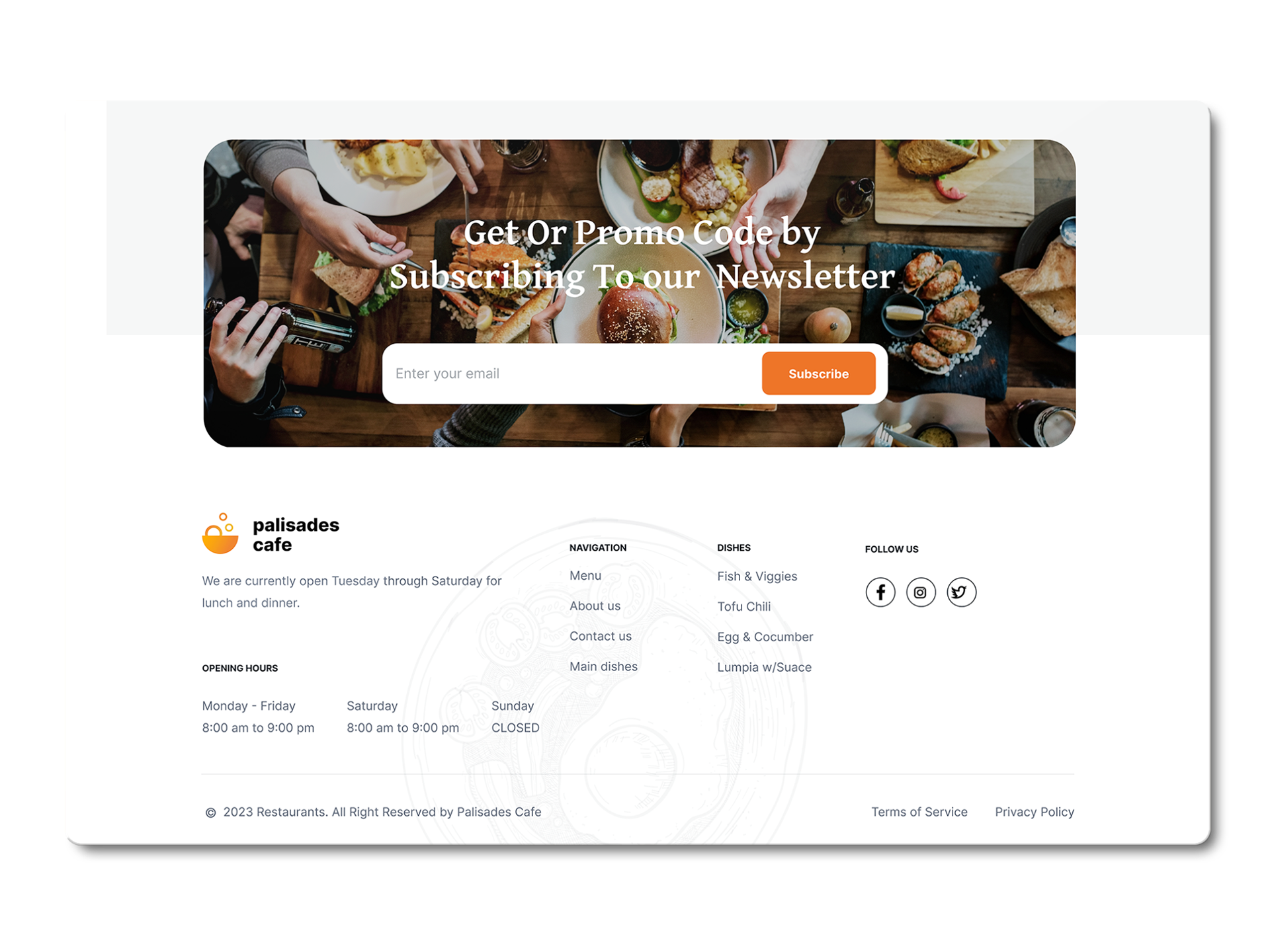
Wireframes and UI Design
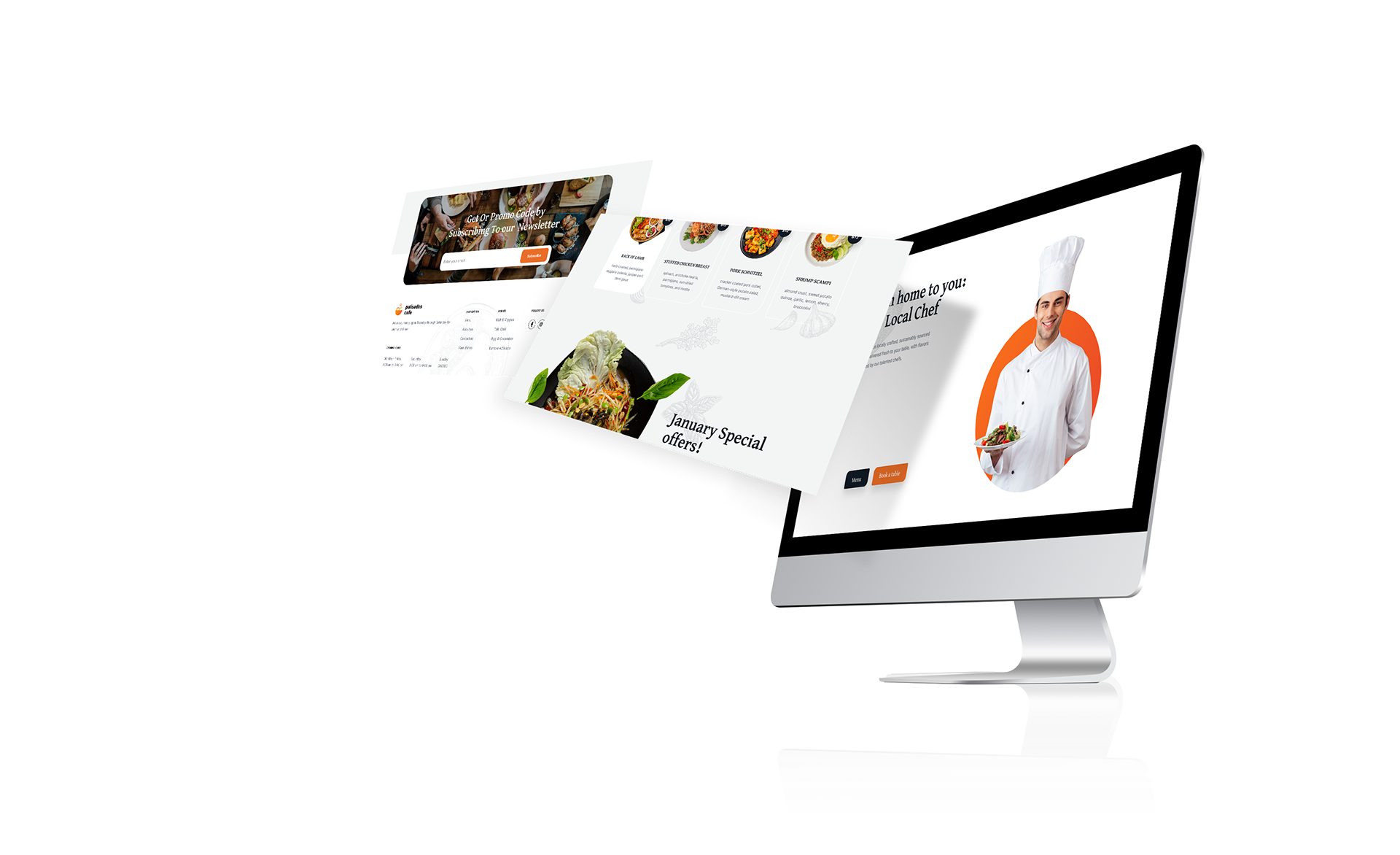
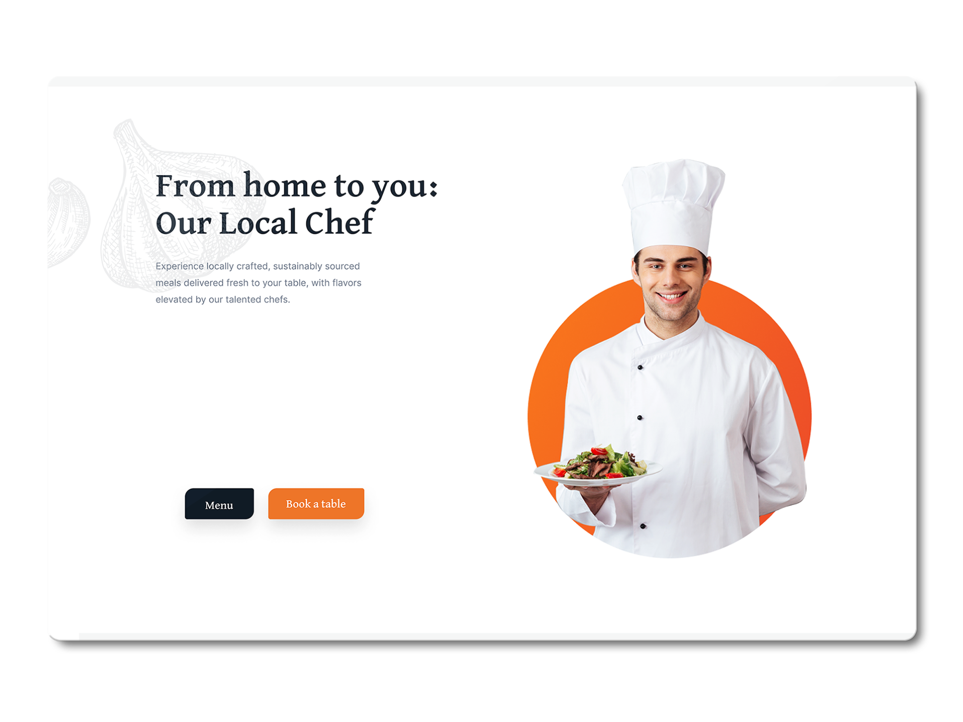
Using low-fidelity wireframes, I designed a clean, modern website emphasizing the cafe's farm-to-table ethos. The site features a warm, organic color palette to reflect the cafe’s atmosphere. The redesigned homepage immediately presents key actions like making a reservation and viewing the seasonal menu. I ensured accessibility throughout by selecting legible fonts and high-contrast colors.
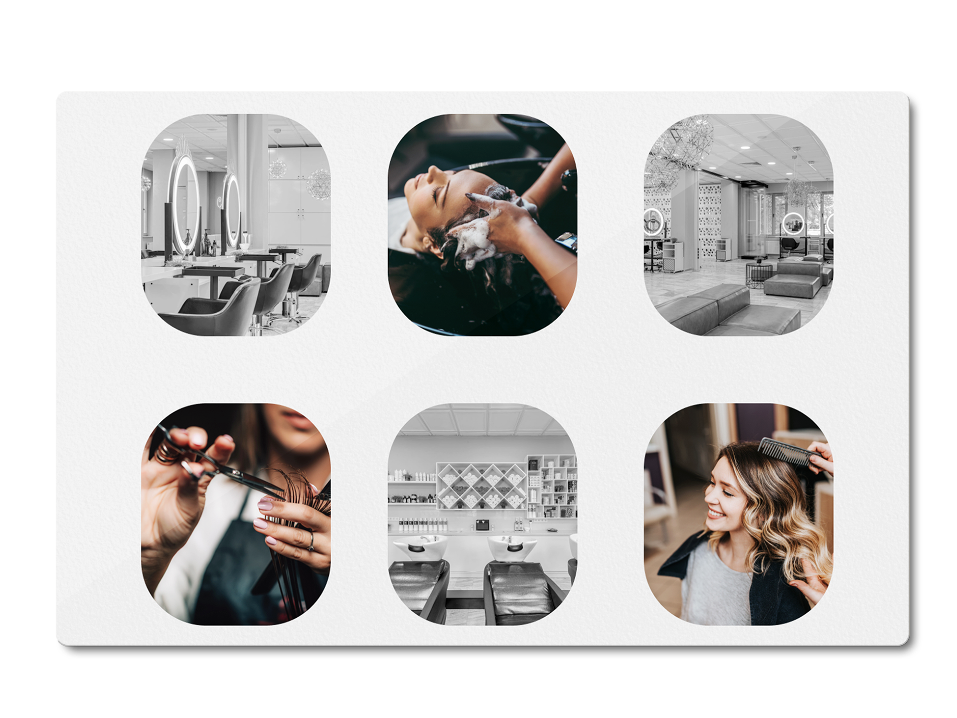
ShearImage Beauty Salon
Challenge:
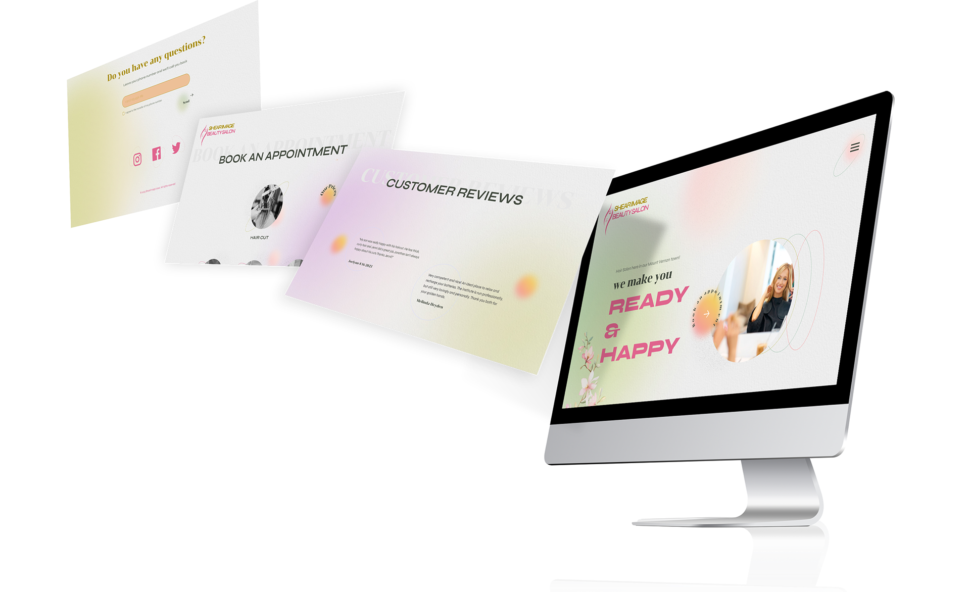
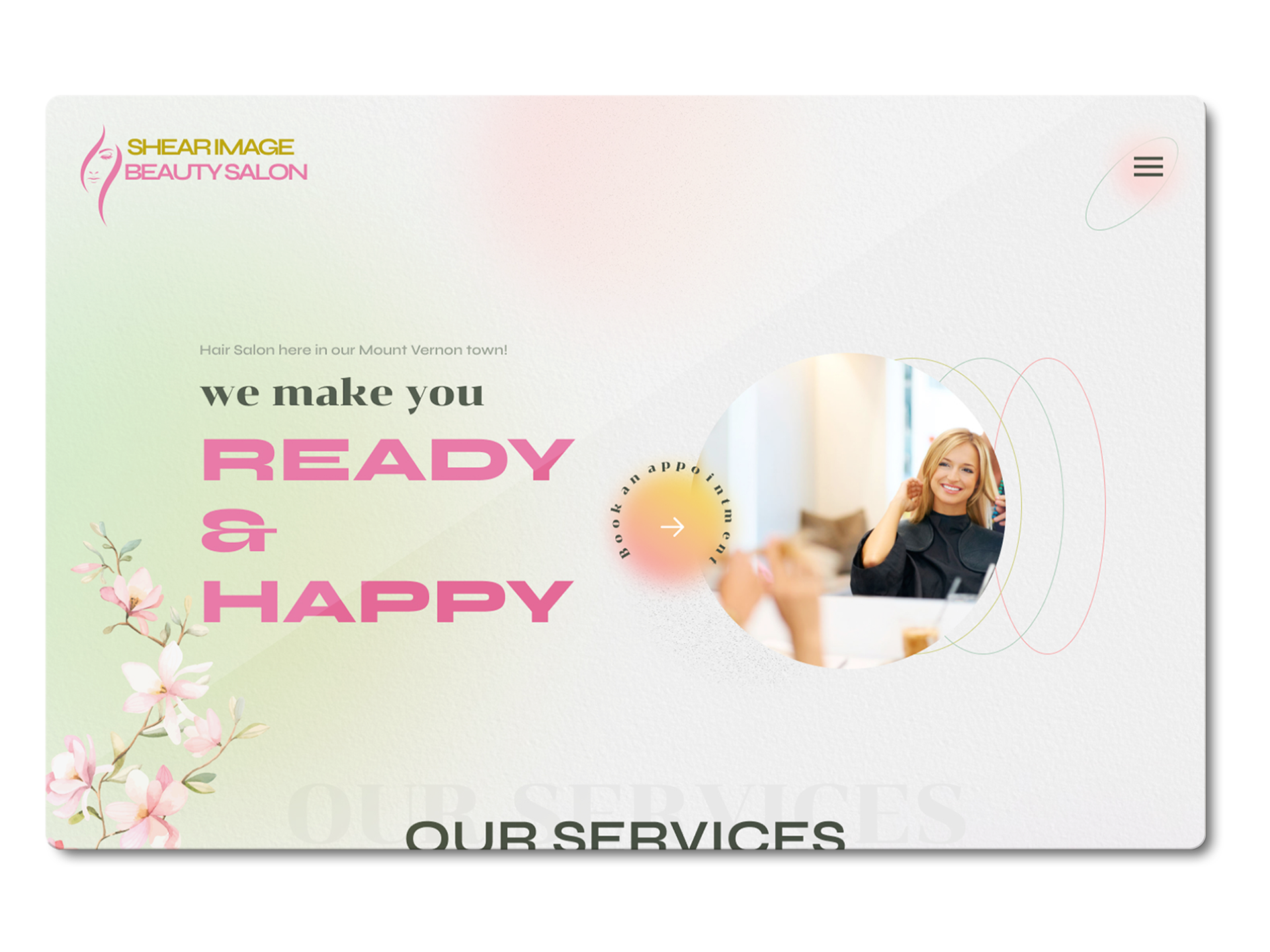
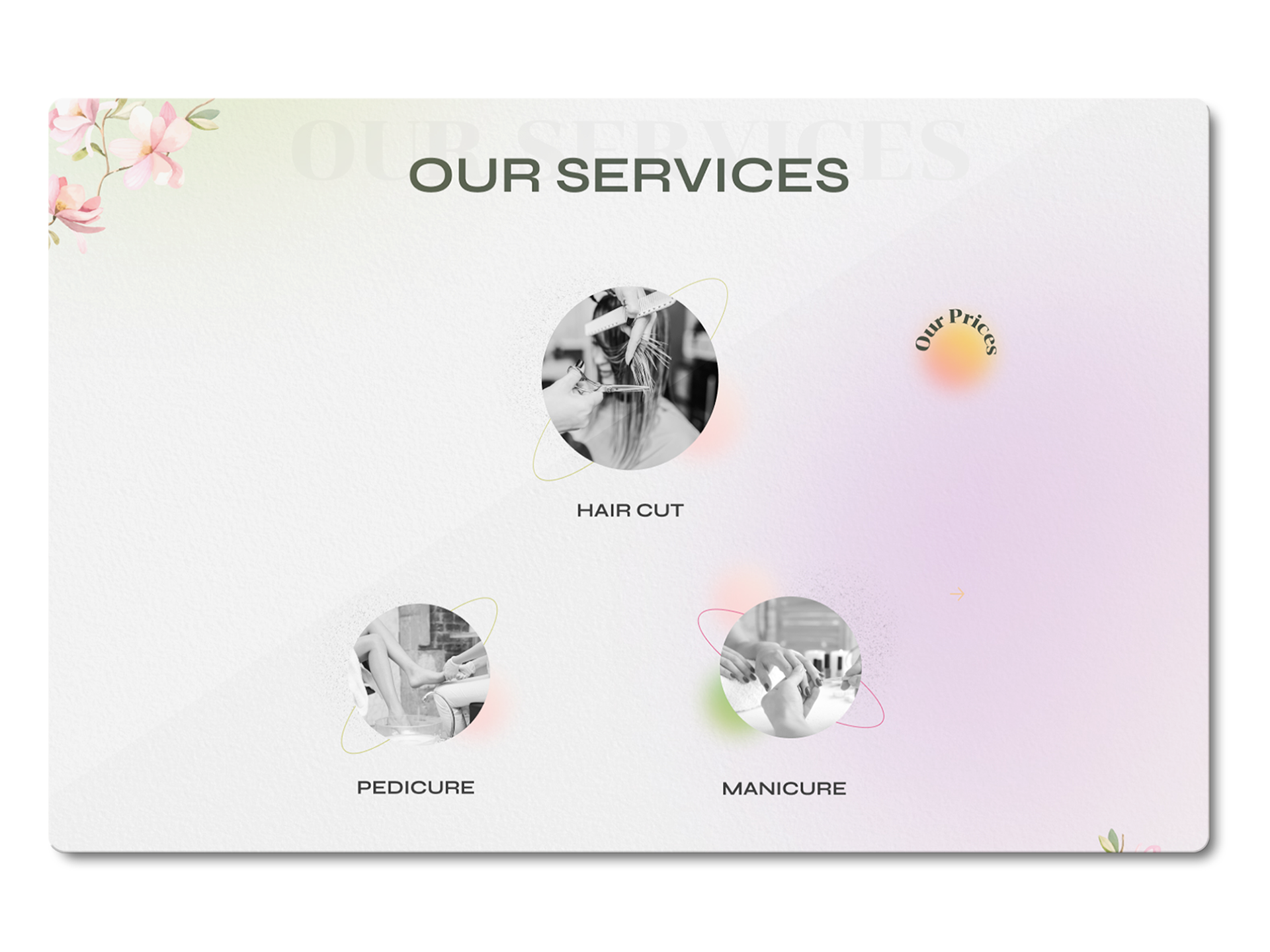
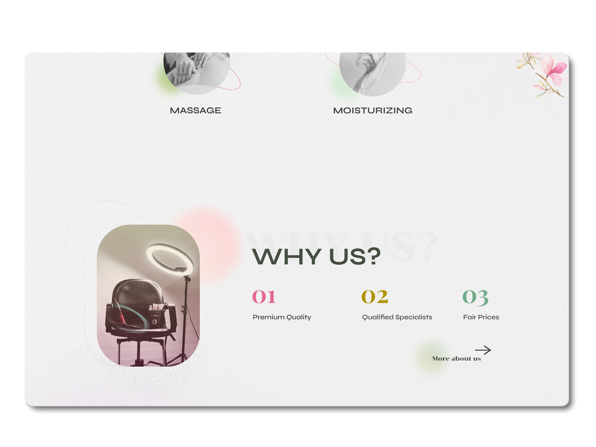
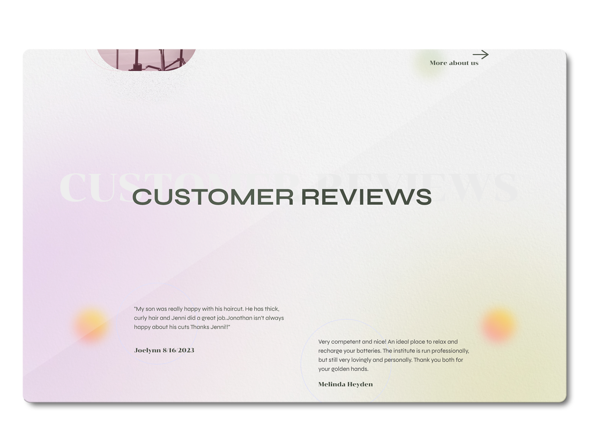
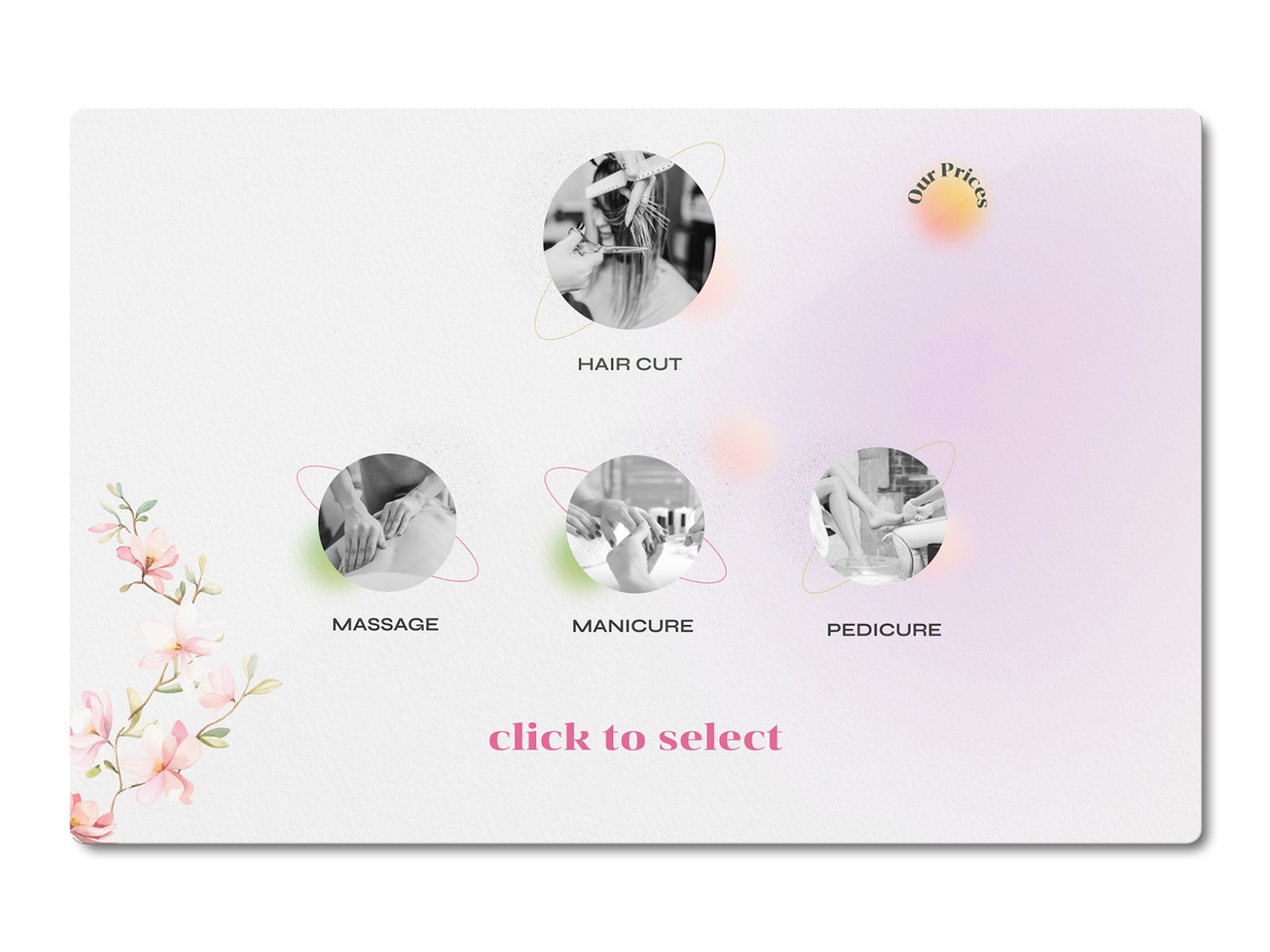
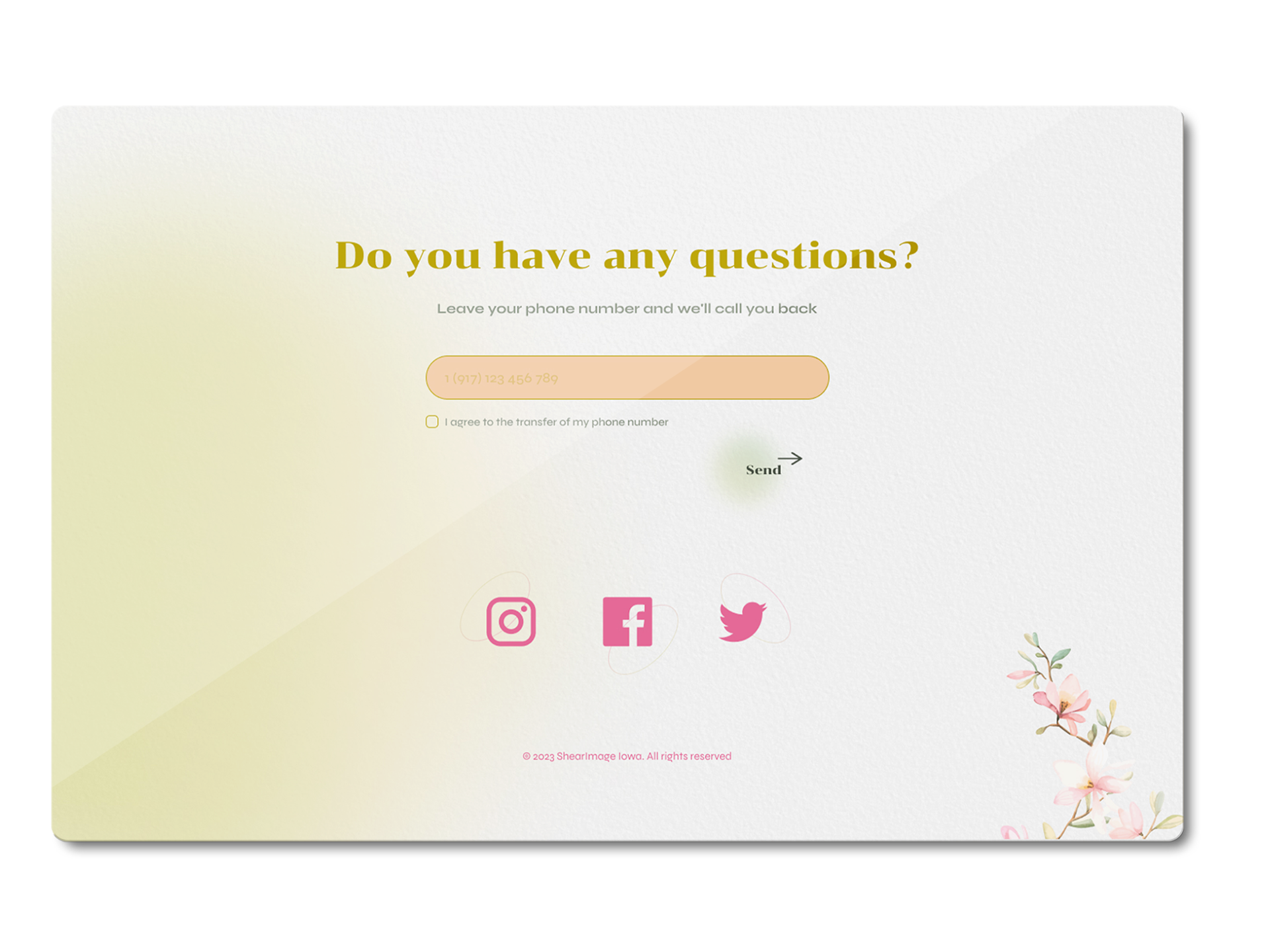
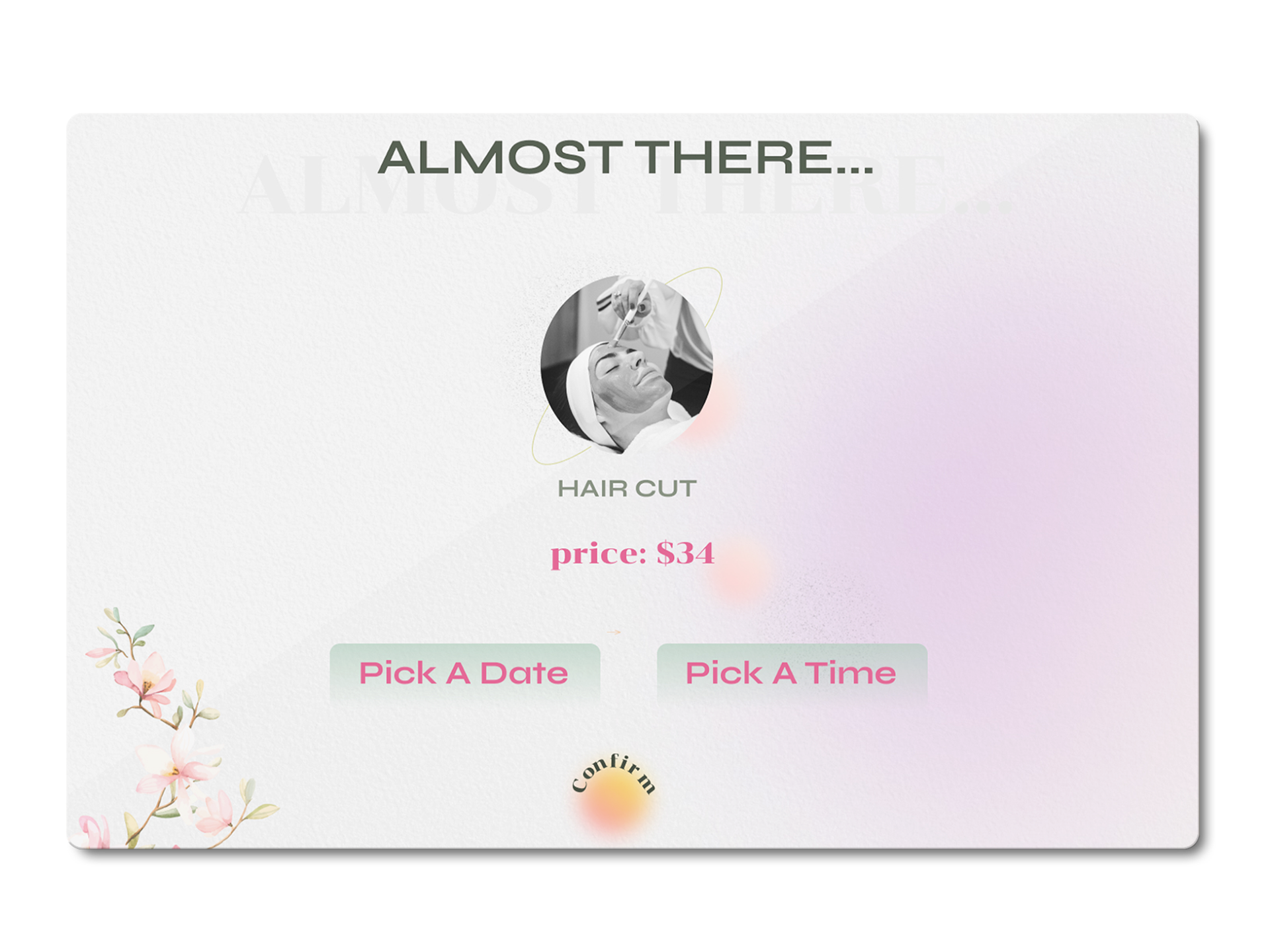
ShearImage Beauty Salon lacked a cohesive digital and visual identity. Their website was cluttered, with a confusing booking process that often led to missed appointments. The salon’s branding also failed to reflect the quality and style of services offered.
ShearImage Beauty Salon lacked a cohesive digital and visual identity. Their website was cluttered, with a confusing booking process that often led to missed appointments. The salon’s branding also failed to reflect the quality and style of services offered.
UX/UI Design Process:
I conducted UX research, including surveys and user testing, to understand what potential clients were looking for in a beauty salon’s digital presence. Based on this research, I created personas for customers who prioritize premium, customizable services and need an easy-to-use booking system. These insights informed a streamlined task flow for booking appointments, reducing the steps required to complete a reservation.
Branding:
The salon needed a more modern identity. I created a fresh, sleek logo and used a sophisticated color palette to reflect the salon’s premium services. A comprehensive brand guide was developed to ensure consistency across digital and print materials.